gamingislove
In total, there are 5 points here that I would like to be addressed. So 1 and then 2a to 2d, thanks in advance!
1). So, I do need an actual solution for this, I'll explain again as I don't really know what you mean by "If you just scroll and don't change selection, it'll show the selection."
Issue: I have a menuscreen with an equipment menu part and an inventory menu part. The equipment menu part does not use an equipment box, "Show Equip Box" is disabled. Rather, I leverage the inventory menu part and equipment items from there by dragging and dropping and when 2). is fixed, equipped by pressing RMB. I use the inventory menu part because I only want one menu to display everything not just equipment, I don't want to separate and have duplicate equipment and inventory menus.
Now, my issue is that when the menuscreen is opened for the first time, it seems the very first item in the inventory list is selected. I've shaped the choice buttons to squares to resemble a fake grid inventory. The inventory box has a scroll bar as well so a lot of items can be crammed in that UI space.
What will happen is when the menuscreen is opened for the first time, or if you just have any item selected in the very first/top row, if you then go to the equipment menu part and drag off a piece of equipment, say a sword, then go to the inventory menu part and use mouse wheel to scroll all the way down to the bottom to the point where you'd clearly pass the first row (which you have selected), once that weapon is unequipped and added to the inventory list, the inventory will jump all the way to the top because I guess you have an item in the first row selected.
That is the issue, that I am trying to explain. The sudden jump from the bottom of the inventory box (because you scroll all the way down and dropped the item in there) to the top (because of the item in the top row that was selected automatically) is very jarring.
As such, can you please add an option to allow no item to be automatically selected in the inventory menu part please? If no item was automatically selected, then at the very least there wouldn't be abrupt jumps to the top.
I do not have a "selected" highlight sprite for these item icons either, only hover/normal so that just adds an additional layer of confusion to the player (since the player doesn't know that in the background an item is technically selected automatically). I deemed that there is no reason to have selected highlights in this case, it's not a console game. I only realized that an item was automatically selected because by chance I defaulted back to default button settings.
I've also tried enabling the setting "Cursor Over Selection". This partially solves the issue by making it so that wherever your cursor is, an item will be selected and you can't visually see that because I don't have the selected highlight so in most cases by the time you've scrolled down to the bottom of the box your cursor has hovered over an item near the button and selected it which means by the time you've dropped the item off from equipment to inventory, there won't be any abrupt jump because your cursor would have been over the item you just dropped off thus selecting it when it appears in the inventory list.
That said the above ^ still has issues. Firstly, I find it somewhat unintuitive as now the behavior of automatically selected is globally enabled and I have to now go back into every UI box I've created to block it when it was only used for this specific UI box. It would make more sense having it as an individual option would it not?
The other thing is it creates another issue, so I'm just trading one UI quirk issue for another. The new issue that occurs with "Cursor Over Selection" enabled is because items are automatically selected just by hovering over, the UI will abruptly jump up and down when you are hovering over an item at the very top or bottom that is just appearing. What I mean by that is if you've scroll down slightly and now you can see like 1/4 of a new row emerging from the bottom, if you hover over it, the UI box will jump all the way down to center/focus on it.
I get that the above ^ is probably default behavior but ultimately it rules out using "Cursor Over Selection".
Solution: I really need to get this UI quirk resolved so I feel like either an option to make it so that no item is automatically selected by default or an option to disable the UI "centering/adjusting" the scroll view when selecting items. Can you please add one of these options so I can resolve this quirk?
2). I tried the alternative setup, but I still have issues with it, and I coincidentally found out the issue with my sub-menu not appearing consistently as outlined in my previous thread "Inventory Containers/Slots - Questions".
You can see this behavior for yourself easily enough if you set it up in the 3D RPG Playground project.
I downloaded the UI menu prefabs from the "Inventory Containers" guide. I use the "Submenu UI Box" as is however it is important to note that this is still done in the traditional "Inventory" menu part, I'm not using an inventory container (slots) menu part.
In the inventory menu part, I've set up the sub menu like this.
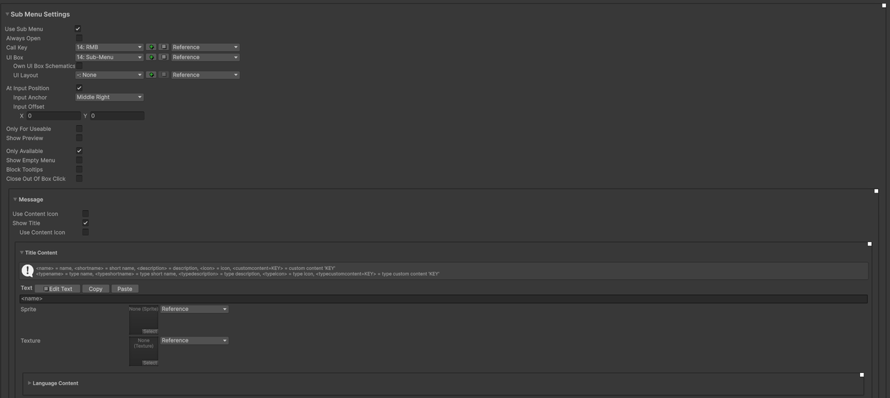
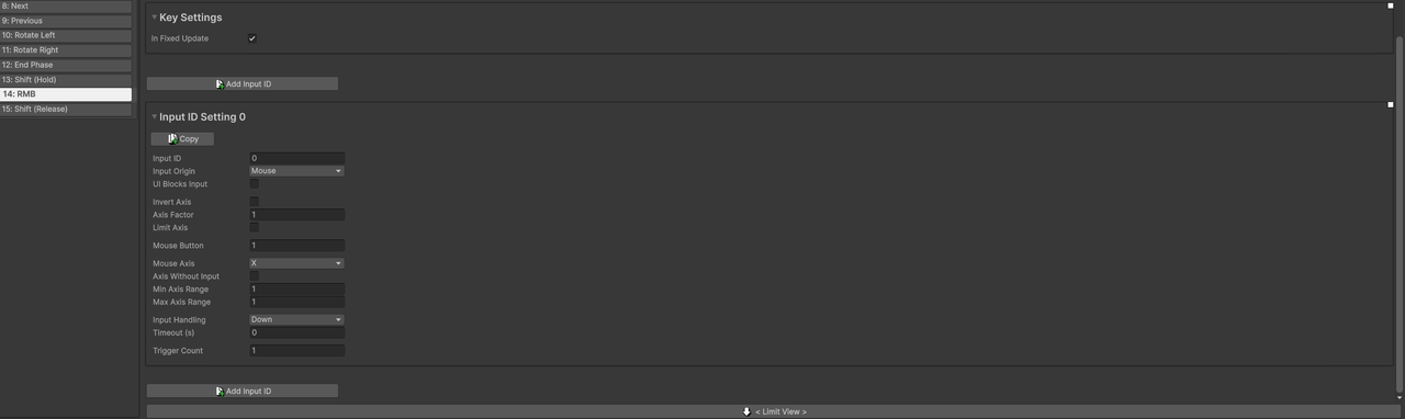
- So, like you suggested, I have a separate RMB input key that is used to call the sub menu.
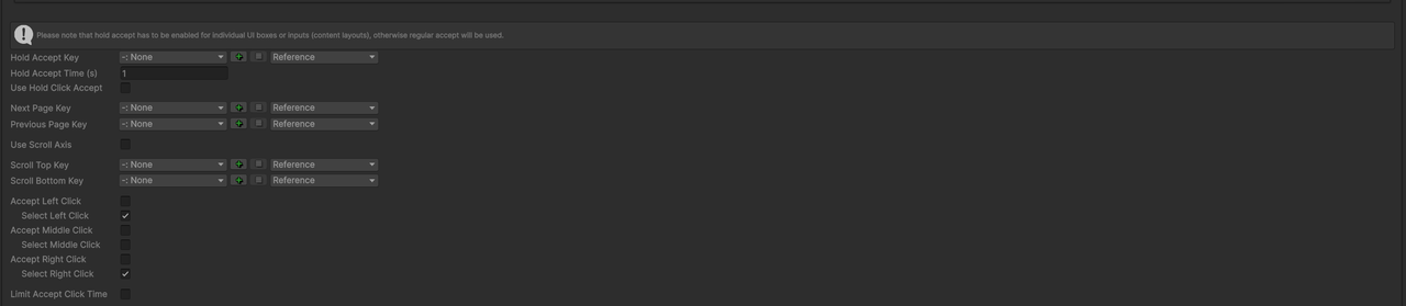
- Then in the UI box that is used by the inventory menu part, I defined own controls. Left click and right click is set to "select" only as I originally wanted it so that LMB would be used for dragging only and clicking RMB on an item would equip it but not drag it, so the alternative solution was to trigger a submenu.
Now, onto the actual issues. All of these can be replicated in the 3D RPG Playground demo if you follow my above setup.
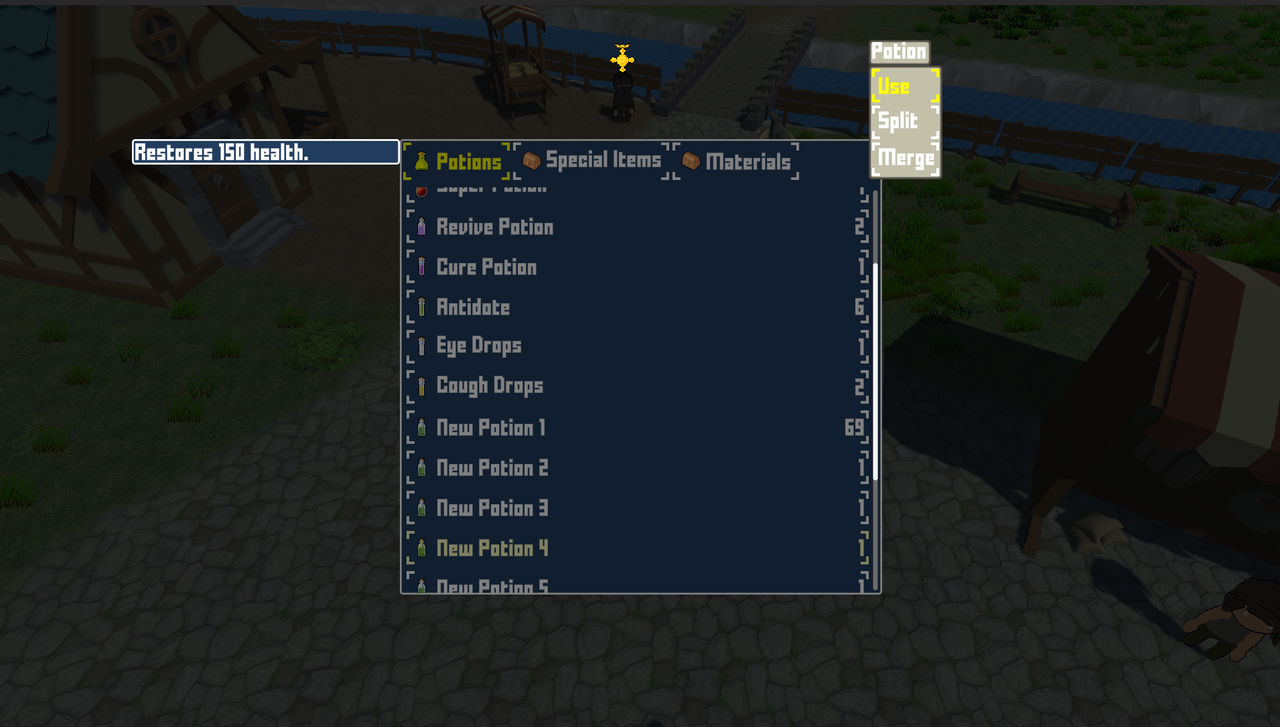
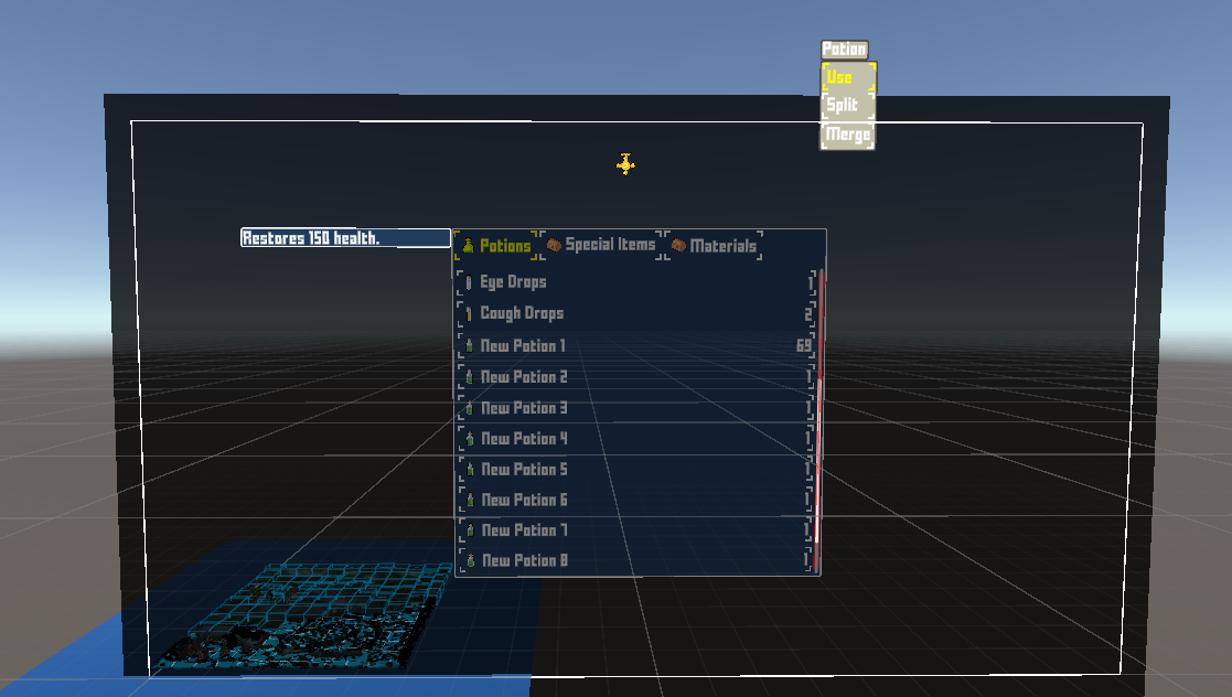
2a). Clicking RMB on any item on the "first attempt" doesn't actually open the submenu for that specific item that you just hovered over and clicked RMB. This is the expected behavior that most players would expect. From the image below you can see that by default "Potion" is selected/yellow highlight and the submenu is opened near its potion however I triggered this by hovering over "New Potion 1" which is all the way at the bottom/tan highlight.
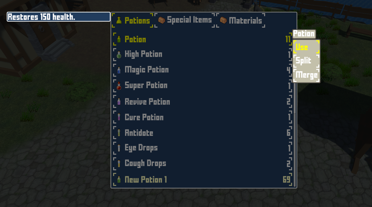
In order for me to get the submenu to appear at "New Potion 1" position, I have to click LMB on the item first which feels too janky. I can't seem to select it first by clicking RMB. If I could select the item first with RMB then I assume it would work correctly as after selecting it, it would also call the submenu, or is there an ordering/priority issue here?
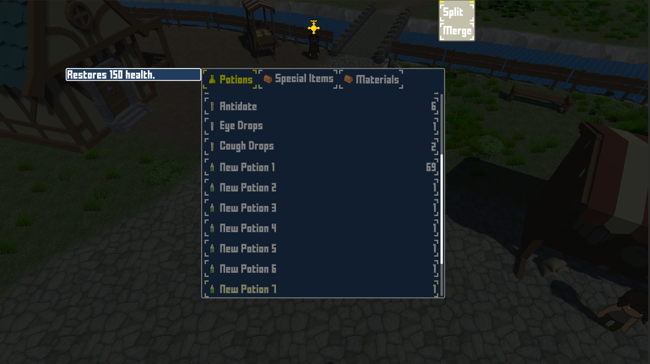
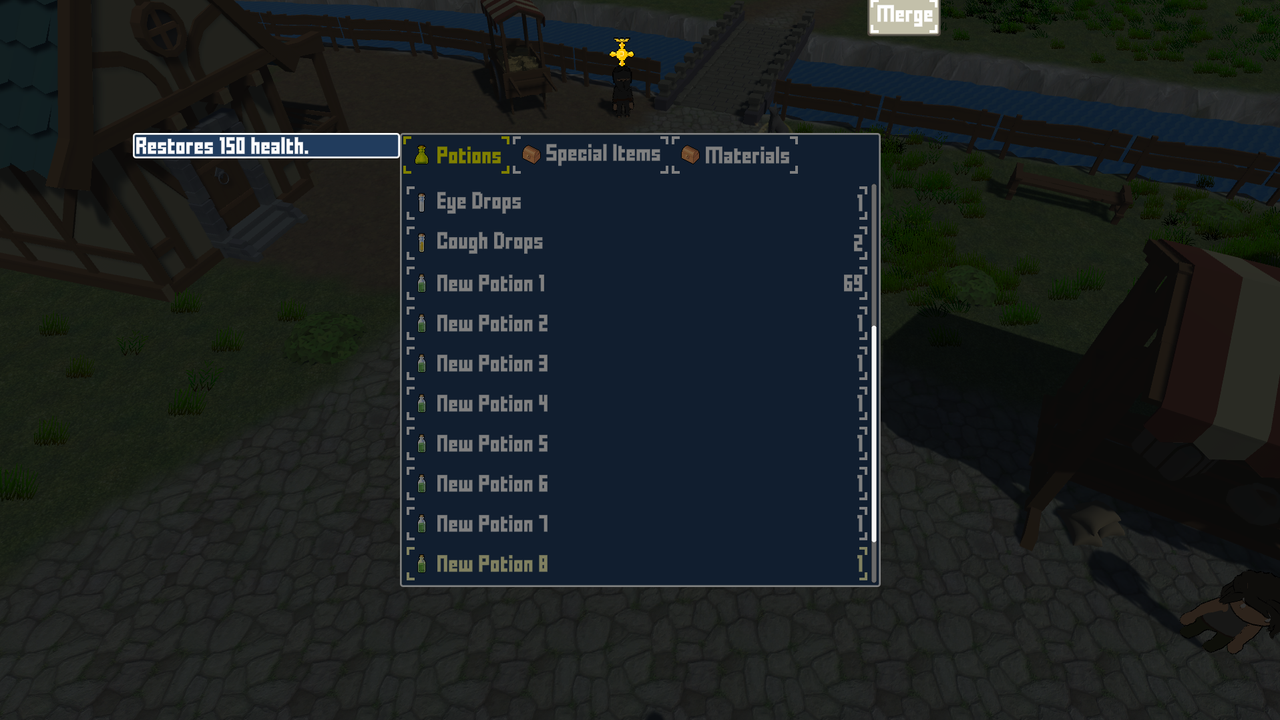
2b). Because I cannot trigger the submenu by just hovering over an item and clicking RMB, another issue will occur. This issue occurs when you have a long list of items/scroll box and you are scrolled all the way down to the bottom. What will happen is the submenu will steadily be pushed upwards the further you scroll down and eventually it won't appear on the screen as it is being pushed up and beyond the canvas bounds.
You can see in the images below, I've defined New Potions 1-9. The further I scroll down and attempt to call the submenu on the item I hovered over with RMB the further the submenu (which is actually still only being called for the first item "Potion") will be pushed up/cut off and eventually it will be pushed completely out of the canvas bounds.
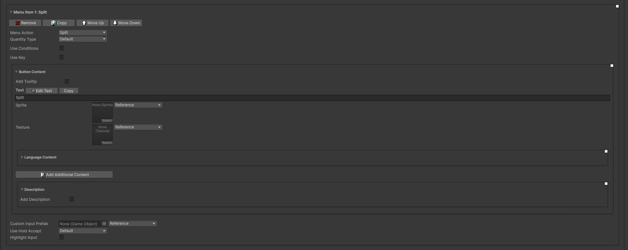
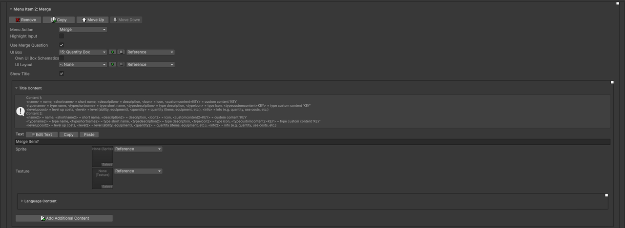
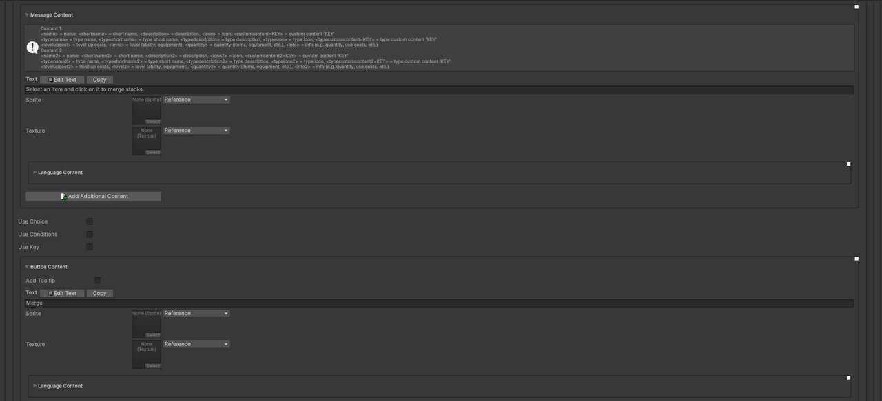
2c). This issue now has to do with the "merge" option that you call via the submenu. Again, this is for the inventory menu part rather than the inventory container (slots) menu part. The issue is the UI box that is meant to appear after you enable "Use Merge Question" does not appear. This isn't a UI layer issue either, it just straight up doesn't appear. If I "split" the item stack instead and use the same box that I defined for the "merge" question for the "split" option, the UI box will appear. It just doesn't for "merge", the UI box doesn't spawn at all when I was looking in the scene view/scene hierarchy.
I really need this message box to appear. Even though I am using an inventory list and not containers, since I can still split stacks, I should be able to naturally merge stacks as well. The problem is it doesn't feel as intuitive, so I am using the message popup box to provide additional instructions on how to "merge" item stacks.
2d). Going back to "merging", is it possible to add an option for the traditional "inventory" menu part that allows merging when dragging a stack over another compatible stack? If you defined a limit to the stack, then the remainder would just remain where it is with the "target stack" being topped up to the max. If you could do this, the "merging" of items would feel a little more natural, eg. being able to simply drag an item stack over another compatible item stack to merge them, similar to how it works for "inventory containers" but instead, apply that behavior of drag/dropping + merge to inventory lists.
One of the big reasons why I purchased ORK 3 was for the inventory grids/containers but I operated under the assumption that the UI would behave similar when it came to shops. IE if you have an inventory of grids with slots, you'd assume that if you went to sell things, you could also have an inventory with actual grids that would reflect for the player and the shop. However, that isn't the case, especially for the exchange menuscreen setup so I had to fall back to using inventory lists but I still wanted to keep most of the functionality of inventory containers. So...being able to at least drag/drop + merge items would be really nice as it would at least feel somewhat like a psuedo inventory grid system.