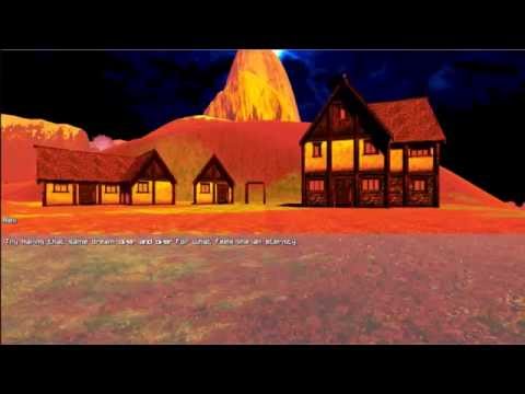
I think I am finally ready to show what I have done so far in Ork.

The game is called "Destimonium" (Basically "Destiny" and "Pandemonium" combined.) and I am planning on having a lot of story elements that will hopefully keep the player interested.

The scenes are all done using the event system and the battle system is definitely ork.
I used a few other assets like "Salsa" for lip syncing, and "Tile a dungeon Sewer kit" for the prison, but the music and the voices are all me.
The battle system will be turn based and will and eventually will have weapons that change your abilities, since the character is only naturally adept at one magic type each.
Check out the video and let me know what you think.
EDIT: wanted to add a couple of pictures of the outside world


EDIT 2:changed the youtube video to add the other 2 floors and more cutscenes

The game is called "Destimonium" (Basically "Destiny" and "Pandemonium" combined.) and I am planning on having a lot of story elements that will hopefully keep the player interested.

The scenes are all done using the event system and the battle system is definitely ork.
I used a few other assets like "Salsa" for lip syncing, and "Tile a dungeon Sewer kit" for the prison, but the music and the voices are all me.
The battle system will be turn based and will and eventually will have weapons that change your abilities, since the character is only naturally adept at one magic type each.
Check out the video and let me know what you think.
EDIT: wanted to add a couple of pictures of the outside world


EDIT 2:changed the youtube video to add the other 2 floors and more cutscenes
Post edited by skwiggs1983 on
check out my Showcase thread here: http://forum.orkframework.com/discussion/2936/showcase-destimonium-intro-sequence#latest
Chillback Digital | web page | Itch.io page | Youtube Page | Made With Unity Page

Chillback Digital | web page | Itch.io page | Youtube Page | Made With Unity Page

Howdy, Stranger!
It looks like you're new here. If you want to get involved, click one of these buttons!


And thank you, glad you enjoyed it.
Chillback Digital | web page | Itch.io page | Youtube Page | Made With Unity Page
Do you have in mind what the story is gonna be about?
Chillback Digital | web page | Itch.io page | Youtube Page | Made With Unity Page
from your pictures u posted on the main screen shot forum u need to make the textures bigger to get rid of the tiling in the distance or u can do a small script to adjust the shaders tiling the further out it is . not actually sure if this is possible in unity with out a custom shader. least not with the unitys basic terrain material. and last but not least the lighting needs some work the areas to bright for a dungeon.
all in all the rest looks good!
Follow the game Development on Twitter https://twitter.com/Fore_Lore_Games
or check out the face book page here https://www.facebook.com/ForeLoreGames
-I am using diffent shaders that will help with the tiling in the outer areas, I'm not too worried about it yet since I am missing a few assets that will be finished soon. and there is one other dungeon that will be seen before the person even sees the world map.
-I had lower lights before, but it did was too dark, for now, I decided to make it bright for testing purposes, but eventually i do have to create better lighting. That will be a bigger priority once more of the gameplay is tweaked. Special attacks are still missing as well as strengths/weaknesses on the enemies.
Thank you for the advice
Chillback Digital | web page | Itch.io page | Youtube Page | Made With Unity Page
Follow the game Development on Twitter https://twitter.com/Fore_Lore_Games
or check out the face book page here https://www.facebook.com/ForeLoreGames
more information here http://forum.orkframework.com/discussion/3907/tutorial-i-think-sky-master-ork-time-system-basics#latest
Chillback Digital | web page | Itch.io page | Youtube Page | Made With Unity Page
Studies show that the majority of people when looking at a website/interface will start from the top left, afterall we do read from left to right as well :)
In the mini boss fight, it was even more jarring. Given that the battle menu is in the left hand corner and the promixity of the 3 characters to it, if you posted a random screenshot and asked a gamer which models he thought he controlled, I wager he'd say the left ones.
Regardless it's my own opinion, but it's the only feedback I can give, everything else looks like it's coming along.
Having the main character on the left is a good idea. I also thought of having the player character in the foreground and the enemy in the background, similar to Lost Odyssey or Final Fantasy XIII.
I will update the showcase when I change the battle camera for more feedback.
Thank you.
Chillback Digital | web page | Itch.io page | Youtube Page | Made With Unity Page